If the soul of a human being can be glanced in someone’s eyes, then the soul of a book is seen in its cover. Well, perhaps, not really, but at the very least, book covers are the thing that turn heads. They get people interested and excited to take a closer look.

Authors oftentimes get caught up in the details of their stories and the desire to represent every nuance in some shape on the cover. Interestingly, that is not always necessary, so I thought I’d put together a list of book covers that truly make an impact and get noticed. Sometimes it is a particular piece of art, at others it is the typography, and at other times it is simply the layout itself that catches your eye.
I purposely decided to use some contemporary examples here, books that are fairly new, because our sensibilities have changed over the years. While book covers like “Psycho” are still incredibly powerful, the paradigm shift in book cover design, away from pure graphic design towards more integrated designs with images, made the covers on the following list a little more… relatable, I thought.
So, here we go…
-
The Red Queen by Victoria Aveyard is a perfect example of a truly classy book cover design that does not go overboard with detail. It makes a simple statement with plenty of space to breathe and the white background to keep things clean. The lettering itself is perfect with a classic font that is not too ornate. It meshes with the image itself without one getting in the way of the other. This is a truly slick design that instantly stands out.
-
To Touch The Stars by Jessica Ruston is a great example how contemporary romance book covers do not always have to feature kissing couples and hunks. This one has style and is is very playful and clean, with a bright color theme that is maintained throughout the entire cover, from the background, the image itself all the way to the lettering. Clearly it is a book that gets its share of attention.
-
Hunter Prey by Sam Saisavath is another truly example for eye-catching book covers. The inversion of the bright top and the dark bottom, combined with the inverted lettering, instantly create a dramatic atmosphere that sets the tone for the book. The silhouette still has enough detail to maintain character and depth, making this a cover that will definitely get noticed. If it had been my cover, I would probably have brightened up the letters H and U to make them a tad more readable, but that is really a minor quibble in a great cover.
-
Oliver & Jack by Christina E. Pilz features a beautiful and effective cover that captures your imagination right away. It transports you. The intricate design and the image set the mood and time period instantly, especially in conjunction with the typography that emphasizes a classic style and the romantic connotations readers have with the Victorian era. The warm color scheme pegs this as a mystery as opposed to a thriller-one that I would like to read right now, as a matter of fact.
-
The Butterfly Mosque by G. Willow Wilson is a lesson in good cover design. Without complex imagery it tells you everything you need to know about the story. The playful script font and the serif type that make up the title clearly point at the human element of the story. So does the butterfly in a jar. The cover entirely lives off the powerful symbolism without design gimmicks and sets the proper mood for this book before you even opened the first page. Note also, how this design also uses light and dark to create depth and prevents the cover from looking flat despite the comparably simple motive.
-
Pride and Passion by Charlotte Featherstone follows the sentiments of traditional romance book covers, but its clean design, warm, consolidated color theme and beautiful motive give it a whole lot of class. It is something that is missing from today’s romance covers all too often, as they tend to strive for overt sexuality rather than actual sensuality. The consistent font design that matches the tone of the background without getting in the way, and the perfectly framed photograph put this cover a definite notch above your average, without losing its genre-specific sensibilities.
-
Monday and the Murdered Man by Andrew Kirschbaum is a beautiful example how classically inspired graphic design can still be appealing in this day and age. It reminds me of the classic James Bond book covers, but because of its choice of color and gradient shading it is distinctly contemporary. The typography is dynamic and eye-catching and also creates good contrast so that the title is easily readable despite the fact that it is so broken apart. For an urban fantasy book this is a very unconventional approach that instantly makes the cover stand out among the competition and gives it a head start.
-
Never, Never by Colleen Hoover and Tarryn Fisher is another example where a simple, powerful image and a design full of symbolism can create a magnetic end result. The two hands reaching in vain for each other signal drama and love. At the same time, the cool blue tone and the rippled text with the light texture accents create a dramatic sense of dread. No other information is needed to get you curious about this book. It sells itself.
-
Midnight Cravings by Michele Hauf, Karen Whiddon, Lori Devoti, Anna Leonard, and Vivi Anna manages to stand out in a genre where book covers are typically so formulaic they all look the same. Paranormal romances are flooding the market and in order to stand out you have to ensure to stay within the familiar framework, yet offer something different. By breaking up colors and working with an accent like the red dress against the complementary blue surroundings, this cover does that very effectively. It also uses a much more traditional font to set itself apart further.
-
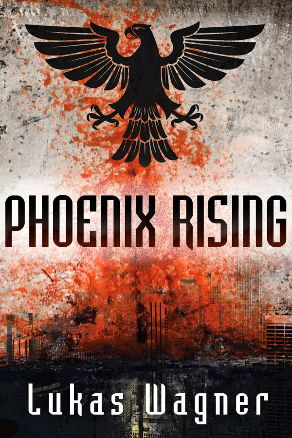
Phoenix Rising by Lukas Wagner is yet another cover where the design itself speaks volumes. Without being overladen, the cover is very gritty and oozes a totalitarian feel as a result of its heavy symbolism. As far as book covers go, this is a great approach. The deliberate use of a somewhat abstract font helps to drive the message home, and just looking at the cover you know that this is going to be an intense read with plenty of brooding darkness.
-
Silence Once Begun by Jesse Ball is another great example, how minimalistic design can have phenomenal impact. The hardcover version of this book features a stylized Asian face with an even more stylized mouth. It is a thriller playing in Japan where a murder investigation is hindered by people unwilling to talk. I cannot think of a more concise way to really boil the story down to its essence, and the cover’s power is clearly testament to it, I think. so much so, that the actual title of the book becomes almost irrelevant because the imagery itself is so iconic.
-
Magonia by Maria Dahvana Headley is a beautiful example for modern book cover design that takes an inspired illustration approach and spices it up with clean typography for best effect. Note how how wonderfully detailed the illustration is and how clean and readable the book title, thanks to the high contrast and the no-frills font type. And yet, they do not compete for attention or space at all, instead creating a cover that has a sense of peace about itself that makes it instantly attractive to the eye.
-
You Don’t Have a Clue by Sarah Cortez, P.S. Carillo and R. Narvaez is a cover that is squarely targeted at kids-and it works. With a Goosebumps feel, the cover oozes mystery as a result of the blue color and the sliver of light from the keyhole. The orange letterings stands out and is instantly readable. Ultimately it is the playfulness of the font and the slightly angled layout, however, that give the cover a warm, yet mysterious, feel without being frightening.
-
Waking Up Dead by Margo Bond Collins is a great example how traditional graphic design can be taken to the next level. And yet, it feels entirely contemporary. It almost reminds me of comic book art. The cutout illustration-with a nod at the original book cover for David Seltzer’s “The Omen”-is crisp and clean, clearly targeting a young audience. At the same time, the tumbling D clearly indicates some self-deprecation and humor. Once again, the cover packs everything you need to know about this book in a single glance, which makes it not only great, but incredibly effective.
-
The Martian by Andy Weir is another great example where a minimalist design pays huge dividends. You look at the cover and you know what kind of story you’re getting-a man by himself on Mars. The intense atmosphere of the image, combined with the simple lettering that is instantly readable, tell the whole story. Note also, how the gradient towards the bottom makes sure the cover has dimension and does not look flat.
-
The Baseball Codes by Jason Turbow uses a bold color to stand out from the crowd. But there’s a lot more going on here besides that. While covering the convoluted regulations, rules, statistics and signals used in the sport as a subject matter, one look at the cover tells you that it doesn’t take itself too seriously, thanks to the choice of fonts and layout.
-
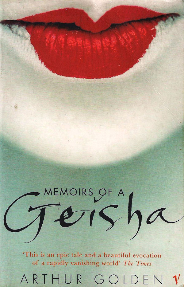
Memoirs of a Geisha by Arthur Golden has had a number of cover designs, but this version stands out in my opinion. Again with a single glance you grasp the essence of the story. It has plenty of space to breathe and doesn’t crowd the cover with detail. Nicely artful lettering tells the reader that the book is equally artful and does not go for flash in the pan, while the white face and iconic red lips define the setting. At the same time they also add an important splash of color to the cover, that draws in people’s eyes.
-
William Shakespeare’s The Phantom of Menace by Ian Doescher instantly catches your eye. Queen Amadala in a book with Shakespeare in the title and a cover that looks like a vintage classic? One look and you’re intrigued. One look and you are clicking on it to find out more. One look and you’re hooked, lost in the details of the amazing cover illustration. Everything about this cover is smart from the title, the typography, and the layout to the design itself.
-
Crow Moon by Anna McKerrow stands out in the field of YA book covers because it is breaking with convention and delivers an illustrated design that is stark and bold. The play with the juxtaposed contrast of black and white throughout makes this cover quite eye-catching. The clean execution helps to set this book apart, drawing the eye instantly. It also helps that the font selection for the title keeps it very readable even at small sizes.


That’s my list for now. Naturally, there are many other covers that are making an impact and I am sorry they didn’t make the list. By the same token, I am sure that there are countless fantastic covers out there that I haven’t even seen yet. So feel free to show me your favorite covers.

It won’t come as a surprise to you that as I am designing book covers, I try to produce results that have equal impact. Designs that are equally eye-catching and remarkable. As you can imagine, it is hard for me to judge objectively how well I meet the mark. Here, for example, is a cover I designed that I am very proud of. It is for Hunted, a supernatural thriller by Guido Henkel. As you can see, I’ve been trying to stay true to the design lessons as I could, in order to achieve a stand-out result. I tried to keep the layout simple without too many graphical elements. I added drama and depth through the intense use of light and dark. I used a bold lettering that is the focal point of the cover, all the while trying to convey the setting and period, as well as the genre of the book. What do you think? Did I succeed? Does the cover make an impact?
One comment